


Key Takeaways
01.
Good mobile UX starts with the user's core job, not the visual style.
02.
The strongest mobile app experiences reduce unnecessary decisions, inputs and navigation steps.
03.
Navigation should be predictable, while gestures should enhance the experience rather than hide essential actions.
04.
Onboarding should get users to meaningful value quickly and request permissions only when there is clear context.
05.
Loading, empty, error, offline, success and recovery states are part of the experience, not edge cases.
06.
Accessibility and performance should be designed alongside the interface, not checked after development.
07.
Prototypes are most valuable when they test risky journeys before those decisions become expensive code.
08.
Cross-platform development still needs platform-aware UX for iOS and Android.
09.
Post-launch analytics and usability testing should continuously inform UX improvements.
10.
A strong mobile UX partner should connect research, UX, UI, prototyping, and engineering rather than treating design as a handoff.
People rarely leave a mobile app because a button is two pixels out of place.
They leave because the app makes a simple job feel harder than it should: unclear navigation, unnecessary setup, poor feedback, vague errors or lost work after an interruption.
That is the difference between mobile UI design and a genuinely useful mobile app user experience.
Good UX is not about adding more screens, animations or features. It is about removing friction between intention and outcome.
That matters commercially. Better UX can improve task completion, reduce support friction, strengthen activation and make a product easier to trust. Baymard's 2026 mobile-app research continues to show that even leading apps have significant room for UX improvement; its latest benchmark includes 3,300+ performance scores and 2,500+ best-practice examples across 10 apps. Baymard Institute
For product teams, the useful question is therefore not:
"How should our app look?"
It is:
"What should the user be able to accomplish easily, and what gets in the way?"
At Designoweb, we approach mobile app UX design as part of product engineering. That means connecting user research, journeys, information architecture, prototypes and interface design to the engineering realities that follow.
01
What Good Mobile UX Actually Means
A polished interface can still produce a poor experience.
UI is the visible layer: typography, colours, buttons, cards, icons, screens and hierarchy. UX covers the larger journey: understanding the product, finding the right feature, completing the task, receiving feedback, recovering from mistakes and handling different usage contexts.
Nielsen Norman Group's usability heuristics emphasise visibility of system status, consistency, error prevention and user control. Nielsen Norman Group
Apple's current Human Interface Guidelines similarly emphasise purpose, simplicity, flexibility and understanding how people interact with products. Apple Human Interface Guidelines
A good mobile UX makes the next useful action obvious.
Start with the user's job
Before designing a screen, define the task.
For a banking app:
"I need to know whether I can afford this payment."
For a healthcare app:
"I need to book the right appointment without calling someone."
For a logistics app:
"I need to know where the shipment is and what I should do next."
For a property app:
"I need to find suitable properties within my budget."
This changes the design conversation from screen creation to outcome design.
12 Mobile App UX Best Practices That Matter
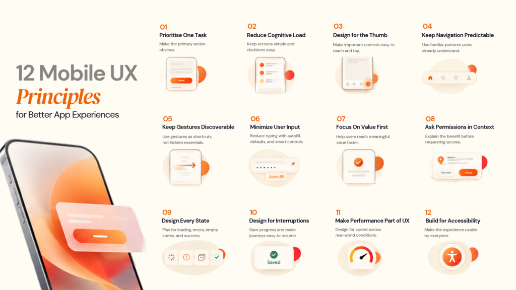
1. Design around one primary task
A screen with five equally prominent actions forces the user to decide where to look before deciding what to do.
Establish a clear hierarchy:
| Element | UX role | Typical treatment |
|---|---|---|
| Primary action | Main task | Highest visual priority |
| Secondary action | Supporting task | Clearly visible, quieter |
| Tertiary action | Occasional task | Contextual or secondary control |
| Information | Helps decision-making | Supports the action |
| Destructive action | Higher risk | Separated and recoverable |
The screen should make the next useful action obvious.
2. Reduce cognitive load
Mobile users have limited attention and limited screen space.
Reduce unnecessary mental work by:
- grouping related information
- removing fields the product does not need
- using familiar terminology
- showing information progressively
- preserving entered information
- using sensible defaults
- making the next step clear
- avoiding redundant confirmation screens
For a complex enterprise application, progressive disclosure can be especially valuable: show the information needed for the current decision and keep deeper detail available when needed.
3. Design for the thumb, not the cursor
Mobile interaction is physical. A user may be walking, travelling, holding a child, carrying a bag or using the phone one-handed.
Apple recommends a minimum 44×44 pt hit region for buttons. Android's accessibility guidance recommends touch targets of at least 48×48 dp for touch interfaces. Apple Developer Android Developers
The important point is that the visible icon itself does not have to be 44 or 48 units wide. The interactive area around it can provide the necessary target.
Pay particular attention to:
- navigation controls
- close buttons
- filters
- small icon buttons
- adjacent actions
- destructive controls
4. Make navigation predictable
Users should not need to learn a private navigation language for your product.
Use familiar patterns when they fit the product. Apple's current guidance covers navigation structures and search placement across Apple platforms, while Android similarly encourages consistent interaction patterns. Apple Developer Android Developers
Audit your navigation with five questions:
- Where am I?
- What can I do here?
- How do I go back?
- Where will this action take me?
- Can I reach important functionality without remembering a hidden gesture?
A navigation problem is often an information-architecture problem, not a visual one.
5. Use gestures as shortcuts, not secrets
Swipe, drag, long-press and gesture-based interactions can make mobile apps faster.
They become problematic when a critical task depends on a gesture the user cannot discover.
A practical rule:
Important action → visible control
Efficiency shortcut → gesture
6. Remove unnecessary input
Typing on a phone is expensive.
Whenever appropriate:
- use autofill
- reuse information already supplied
- select instead of type
- use appropriate keyboards
- preserve data after validation errors
- use date and time controls
- scan information with the camera when it makes sense
- avoid asking for the same information twice
The goal is less unnecessary work.
7. Treat onboarding as a value exchange
Onboarding should answer one question:
How quickly can the user experience meaningful value?
For some products, account creation is necessary immediately because identity, security or saved data is central to the product.
For others, users may be able to browse, search, compare, preview, calculate or configure before registering.
Ask which information users genuinely need before first use and what can wait.
8. Ask for permissions in context
Permission requests are interruptions.
A stronger sequence is:
User chooses feature → explain value → request permission → continue
For example:
"Use your location to show nearby properties."
is more useful than requesting location as soon as the app opens.
Also design for refusal so optional permission denial does not unnecessarily break the experience.
9. Design every system state
A production screen has more than a happy path.
| State | What the user needs |
|---|---|
| Loading | Evidence that something is happening |
| Success | Confirmation and next action |
| Empty | Explanation plus a useful next step |
| Error | What happened and how to recover |
| Offline | What still works |
| Syncing | Whether changes are saved |
| Permission denied | What is affected |
| Session expired | Safe way back into the task |
| Partial data | Clear distinction between known and missing information |
This is one of the biggest differences between a convincing prototype and a production-ready product.
10. Design for interruption
Calls, app switching and connectivity loss can interrupt mobile sessions. Use draft saving, resumable journeys, preserved state, queued actions and clear sync status.
11. Make performance part of UX
Performance is not something engineering should solve after the screens are finished.
Design decisions affect performance:
- high-resolution imagery
- remote components
- animation
- content density
- API-dependent screens
- blocking actions
- what loads immediately versus later
Android's current core app-quality guidance treats loading feedback, rendering, stability and support across device configurations as part of app quality. Android DevelopersDesign and engineering should therefore agree on:
- what must appear immediately
- what can load later
- what can be cached
- what happens on a slow connection
- which interactions must feel instant
- how failure is communicated
12. Build accessibility into the interaction model
Accessibility is not a final checkbox.
W3C's mobile accessibility guidance explains how WCAG applies to mobile applications and highlights challenges involving touch, small screens, multiple input modalities and changing usage contexts. W3C Mobile Accessibility
Evaluate:
- touch target size
- colour contrast
- text scaling
- screen-reader labels
- focus order
- dynamic announcements
- error identification
- alternative text
- motion
- orientation
- keyboard or switch access where applicable
Apple's current accessibility guidance also emphasises appropriate control sizes and spacing between interactive elements. Apple Developer
Accessibility often improves the experience for everyone.
| Question | What to measure |
|---|---|
| Can the user find the task? | Discoverability |
| Do labels make sense? | Recognition |
| How many decisions are required? | Cognitive load |
| How many interactions are required? | Interaction cost |
| Can the user recover? | Recovery |
| Can the user resume later? | Resilience |
| Can assistive technology complete it? | Accessibility |
If users fail before the first meaningful interaction, changing the button colour will not solve the problem.
Native patterns vs custom patterns
Custom design is useful when it improves the product.
It is less useful when it forces users to relearn common actions.
Apple's Human Interface Guidelines explicitly encourage familiar, consistent experiences, while Android provides established design and accessibility patterns for the same reason. Apple HIG Android Developers
The best mobile UX is rarely the most visually unusual. It is the one that feels natural while still giving the product a distinct identity.
03
Onboarding, Forms and Permissions
Three areas often determine whether a new user reaches value:
onboarding, authentication and first-use interaction.
Treat them as one journey.
Use the first-value test
Ask:
What is the earliest point where the user can say, "This app is useful"?
Then work backwards.
If users have to complete a tutorial, create an account, verify email, complete a profile, approve several permissions and set preferences before seeing the product, the sequence deserves review.
That does not mean removing necessary security or compliance steps.
It means questioning every step.
Design forms around necessity
For every field, ask:
- Does the business actually need this information?
- Does the user need to provide it now?
- Can the system infer it?
- Can it be selected instead of typed?
- Is the right keyboard used?
- Is the format obvious?
- Is the error actionable?
- Is the entered information preserved?
For B2B products, some information may genuinely be necessary for account provisioning, billing or compliance. Good UX is contextual, not formulaic.
04
Designing for Errors, Offline Use and Real-World Conditions
The strongest mobile UX decisions often appear when something goes wrong.
Error messages should answer three questions
What happened?
"Payment could not be completed."
Why, if the reason is useful?
"Your bank declined the transaction."
What can I do now?
"Try another card or contact your bank."
Compare that with:
"Something went wrong."
The second message transfers the problem to the user. The first gives them a recovery path.
Design the offline experience before the outage
If connectivity matters to your application, define the state transition:
Online → Editing → Connection Lost → Saved Locally → Reconnecting → Syncing → Synced
The user should understand what has been saved and what will happen next.
This matters in field service, logistics, travel, healthcare, sales, inspection, warehouse and outdoor products.
Designoweb's RoadtripTribes case study is a useful example of this context-driven thinking. The product combines live tracking, location sharing, synchronised navigation, communication and Android Auto support for users who are physically travelling. The interface therefore has to account for real-world conditions rather than only ideal screen states.
05
Accessibility, Performance and Platform Behaviour
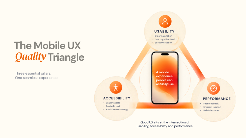
Accessibility should be tested in the built product
A design file can suggest accessibility. Only the working product can demonstrate whether the interaction actually works.
Test with:
- VoiceOver
- TalkBack
- larger text
- reduced motion
- high-contrast scenarios
- different screen sizes
- touch interaction
- keyboard or switch access where relevant
W3C's guidance makes clear that mobile accessibility applies across native, hybrid and mobile-web experiences. W3C
Performance should be measured, not assumed
A product can feel slow even when an individual backend request looks acceptable.
Perceived performance depends on:
- time before meaningful content appears
- visual feedback after a tap
- layout shifts
- animation smoothness
- image loading
- network requests
- screen transitions
- blocking operations
Use platform guidance as engineering signals rather than universal laws.
Design for more than the newest phone
Modern Android guidance explicitly covers adaptive quality across phones, tablets, foldables and other form factors. Android Developers
A mobile UX review should ask:
- Does the layout survive different aspect ratios?
- Can text scale without destroying hierarchy?
- Does landscape mode work where relevant?
- Does tablet UX use an appropriate information structure?
- Are foldable states handled?
- Are external input methods supported where applicable?
- Is state preserved through configuration changes?
Responsive UX is therefore more than stretching a phone layout.
06
A Practical Mobile App UX Design Process
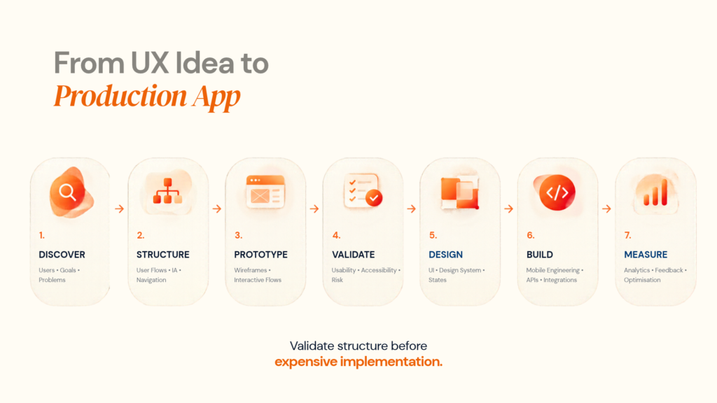
A strong mobile UX process reduces risk before development becomes expensive.
Designoweb's mobile app design services cover user research, customer journeys, UX systems, and iterative mobile design, while its mobile solutions connect design with app development.
A practical process looks like this:
Stage 1: Product and user discovery
Define:
- business objectives
- user groups
- core jobs
- existing pain points
- competitor experiences
- technical constraints
- regulatory requirements
- success metrics
Do not start with colours or screen layouts.
Stage 2: User flows and information architecture
Map primary and secondary journeys, navigation, content hierarchy, permissions, authentication, error paths and edge cases. This is where major product decisions become visible.
Stage 3: Wireframes
Wireframes answer what belongs on the screen, what comes first, what can be removed, how users move between screens and what information is required. Changing structure here is much cheaper than changing production code.
Stage 4: Interactive prototype
A clickable prototype lets a team test the interaction model before committing to full engineering.
Designoweb's prototyping services include mobile application prototyping to explore product structure and feasibility before full development.
Prototype the risky journey, not every screen.
For example:
Search → Filter → Result → Detail → Checkout
can teach a product team more than 40 completed but low-risk screens.
Want to validate the experience before engineering begins? Explore Designoweb's prototyping approach.
Stage 5: Visual design and design system
Once the structure is validated, define typography, colour, spacing, components, states, iconography, motion, accessibility behaviour and platform variations. The goal is consistency without making every interaction identical.
Stage 6: Development, QA and UX validation
Design should continue during development.
Review the built product for spacing, interaction states, responsiveness, animation, accessibility, content, error handling, platform conventions and performance perception.
Designoweb's process connects UX research, journeys, prototypes and UI design with development and testing, rather than stopping at the handoff.
07
How to Measure Mobile UX After Launch
UX is not finished when the app reaches the store.
The first release gives the team evidence about real behaviour.
Track the metric connected to the user's job
| UX question | Useful metric |
|---|---|
| Can users complete the main task? | Task completion rate |
| Where do users stop? | Funnel drop-off |
| How quickly do new users reach value? | Time to first meaningful action |
| Are users returning? | Retention |
| Are users struggling? | Repeated taps / interaction errors |
| Are technical issues affecting UX? | Crash and ANR rates |
| Is the experience slow? | Startup and screen performance |
| Are forms creating friction? | Form completion rate |
| Are changes improving the product? | Controlled experiments |
Do not turn UX analytics into a dashboard for its own sake.
Combine quantitative and qualitative evidence
Analytics can show where users abandon checkout; usability testing, session observation and support feedback help explain why. Strong UX programmes use all of these signals together.
Use a continuous optimisation loop
Observe → identify friction → form a hypothesis → change one thing → measure → learn → repeat
This is safer than redesigning the entire application based on a handful of opinions.
08
How to Evaluate a Mobile App UX Design Partner
When outsourcing mobile app UX design, do not choose an agency only because its portfolio looks good. Ask how the team makes decisions.
| Evaluation area | What to ask |
|---|---|
| User research | How will you learn about our users? |
| Product thinking | How will you prioritise our core journeys? |
| Information architecture | How will navigation and content be structured? |
| Prototyping | Which risky flows will be validated first? |
| Accessibility | How will accessibility be tested? |
| Platform UX | How will iOS and Android differences be handled? |
| Engineering collaboration | How will designers work with developers? |
| Design systems | How will consistency scale? |
| Testing | Who tests the experience with real users and devices? |
| Measurement | Which UX metrics will be monitored? |
| Technical capability | Can the same team support APIs, integrations and development? |
| Post-launch | How will UX issues be prioritised after release? |
A portfolio proves visual capability, but not automatically product thinking.
Look for evidence across the lifecycle
Depending on scope, meaningful deliverables can include research findings, journeys, information architecture, user flows, wireframes, prototypes, high-fidelity UI, design systems, accessibility guidance, developer specifications, usability testing and post-launch recommendations.
Designoweb's design solutions and mobile design practice connect these activities into an iterative, user-centred process.
09
When Good UX Means Saying No
Not every feature belongs in the app.
A feature should earn its complexity.
If a new function requires:
- three additional screens
- another permission
- another API
- another account setting
- another notification type
- another onboarding explanation
ask whether the user problem is significant enough to justify the cost.
The same applies to advanced animations, personalisation, AI features and custom navigation.
Technology can make a feature possible; it does not automatically make it useful.
10
Designoweb's Approach to Mobile UX and Product Development
At Designoweb, we treat mobile UX as part of the product, not a visual layer added immediately before development.
Our mobile app design services cover user research, customer journeys, UX systems, prototypes and UI design. We connect that work to mobile solutions covering native and cross-platform development.
The delivery model is:
Product problem → user research → user flows → prototype → UX validation → UI system → engineering → QA → measurement → iteration
This lets teams test risky decisions early and maintain UX quality through development.
For teams that need a broader product-engineering partner, Designoweb also brings together product engineering, mobile development and digital transformation capabilities.
Author

Frequently Asked Questions
01
What are the most important mobile app UX best practices?
Start with the user's primary task, simplify the journey, make navigation predictable, reduce unnecessary input, design important states, support accessibility and validate decisions with real users.
02
What is the difference between mobile UI and mobile UX?
UI focuses on what users see and interact with. UX covers the wider journey, including navigation, task completion, feedback, errors, accessibility, performance and recovery.
03
How do you improve mobile app usability?
Find friction in key journeys, review task completion, navigation, forms, errors, loading, accessibility and performance, then validate improvements with testing and analytics.
04
How early should UX design start in mobile app development?
Before detailed UI and ideally before development. Discovery, information architecture, flows and prototypes expose risky decisions before they become expensive engineering changes.
05
What should I evaluate when choosing a mobile app UX design partner?
Look at research, product thinking, information architecture, prototyping, accessibility, platform expertise, engineering collaboration, testing and post-launch measurement.